Right Side
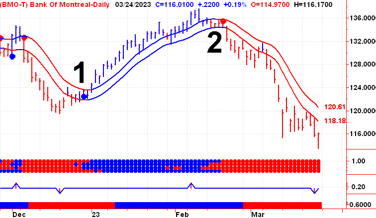
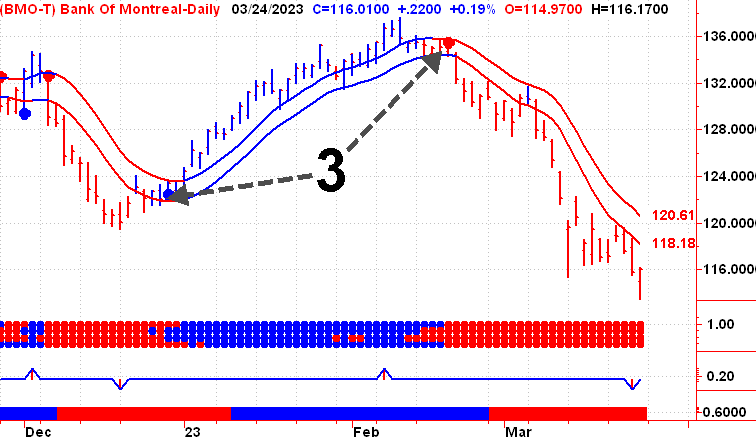
Once you have determined your Market Bias using the Panic Zone chart, we can continue our analysis using the Right Side Chart. The Right Side Chart is a very simple trading system with a Buy Signal being confirmed on the first close above the upper channel line (1). And a Sell Signal is confirmed on the first close below the lower channel line (2). This Trading System is short-term and aggressive, and can give lots of buying and selling opportunities. We want to filter out as many of these as possible by using our Panic Zone chart.
Trend changes are highlighted in our daily and weekly reports.
All of our charts are color coded. Blue is Bullish and Red is Bearish.
The channel lines and price bars change color as the trend changes.
This charts also included Early Warning Signals (3), which you will also find in our daily and weekly reports.
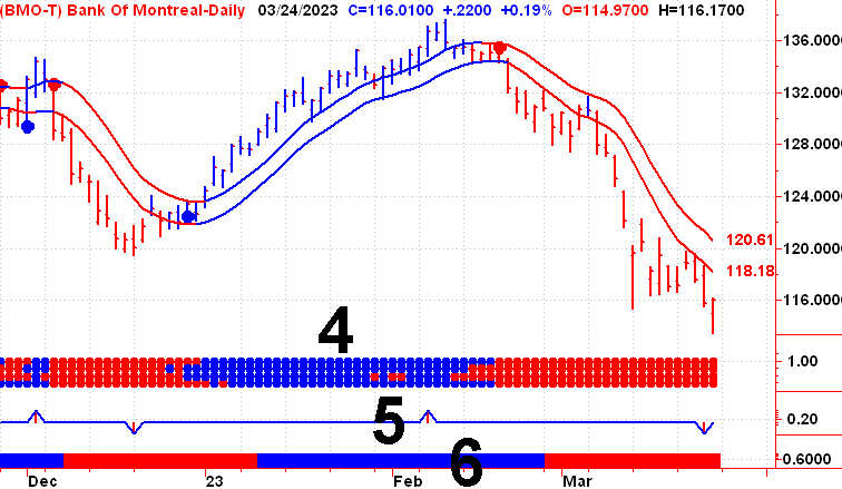
The Right Side chart also includes our Market Consensus indicator (4). Our Turing Point Indicator (5),
and our Dominant Trend Indicator (6).
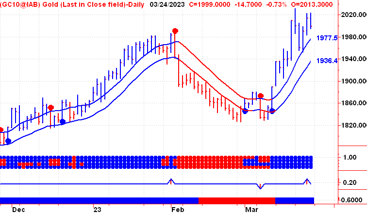
The Right Side Channel lines are adaptive and robust. No matter if you’re following a two dollar stock or gold trading at $2000, they will adapt to the current situation.
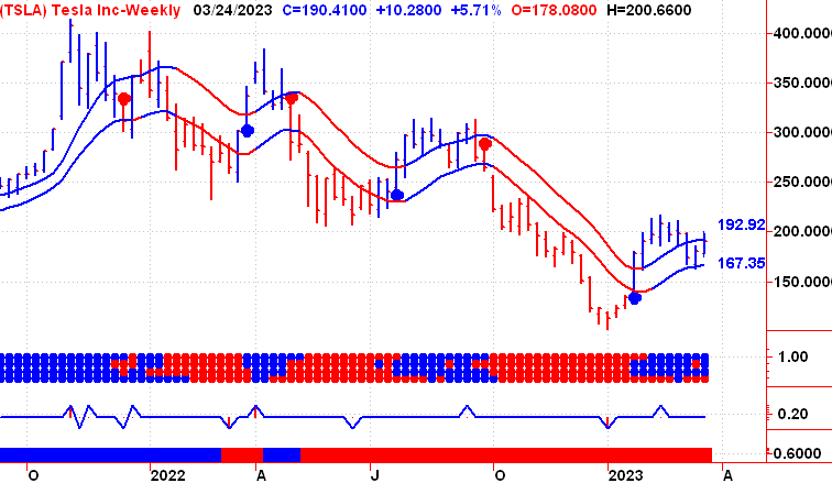
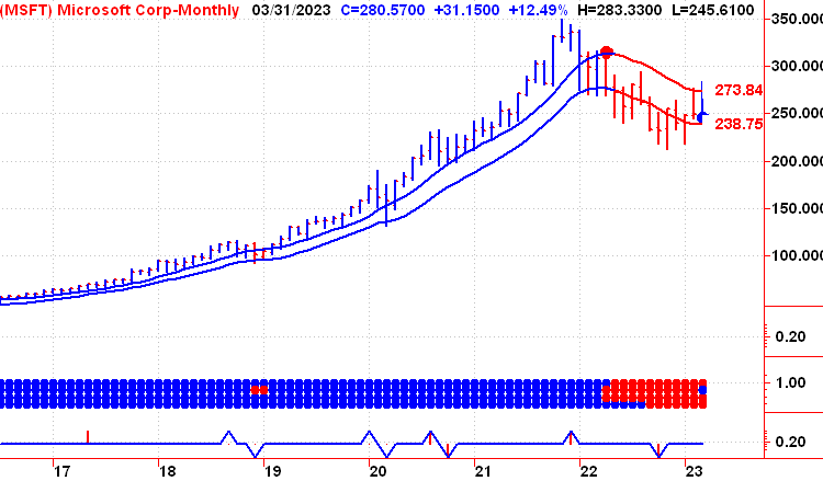
For longer-term investors we also provide a weekly and in monthly Right Side Chart.
Tesla Weekly
Microsoft Monthly.
If you would like to watch these charts in action before becoming a member, please subscribe to our daily video newsletter, Stock Market Timing Television.
