Panic Zones
The purpose of the Panic Zone chart is to highlight irrational market activity. Irrational market activity or Panic often causes market reversals.
When people say that the stock market is based on fear and greed, they are referring to the two primary emotions that influence investors’ decisions in the stock market.
Investors worry about losing money is referred to as fear in the stock market.
Fear can develop for several causes, including political unrest, economic turbulence, or company-specific news like a weak earnings report. Investors often sell their stocks when they are anxious, which lowers stock prices.
On the other hand, the drive for large returns and profits is referred to as greed in the stock market.
When investors are greedy, they often acquire stocks, which drives up the price of the stock.
Both fear and greed can cause the stock market to be volatile with rapid changes in stock prices. The stock market is a complex system that is influenced by various factors, including economic conditions, political events, and company-specific news. However, the emotions of fear and greed can play a significant role in driving market movements in the short term. Investors need to have a long-term perspective and not be swayed by these emotions when making investment decisions.
As stocks rise and fall based on fear and greed, there are certain times when a market may become overly fearful or overly greedy. When these situations arise, they often signal a turning point for the market. Our Panic Zone chart highlights these potential turning points. When the market is overly greedy, we call that Panic Buying. And when the market is overly fearful, we call that Panic Selling.
Low-Risk Buying Opportunities often develop after Panic Selling. And Low-Risk Selling Opportunities often develop after Panic Buying. To find Low-Risk Buying Opportunities, we must be patient enough to wait for Panic Selling, plus enough downward momentum, to form a new Pressure Zone
Looking at the chart below, we can see three areas of Panic Selling. We do not consider these buy signals by themselves, but they do tell us that this is the time and place when we look for low-risk buying opportunities.
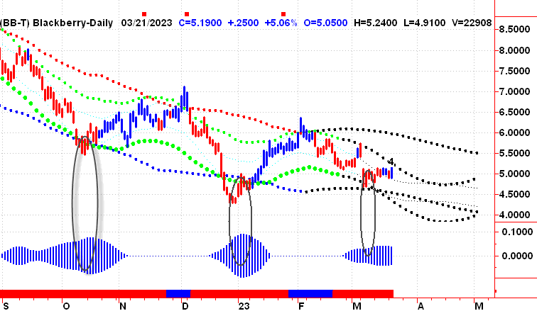
Please note, all of our charts are color-coded.
Blue equals bullish, while red equals bearish.
On the same chart, we can see three areas of Panic Buying. Again, these are not sell signals by themselves, but they do tell us to be on guard for a potential move lower.

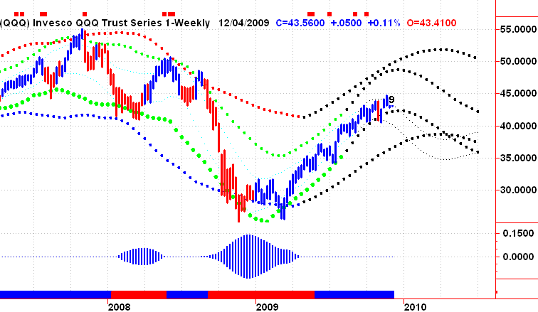
We also post a weekly Panic Zone Chart for every symbol in the database. In this example of the NASDAQ 100 from back in 2009, you can see the early warning signals at the top of the screen and then the 2 low-risk Buying Opportunity Zones. You will also notice that this chart provides a projection into the future. In this example, we were projecting higher prices at the time up to $45.
So what happened next?
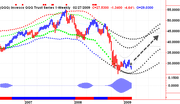
It is important to note regarding any price projection. Mathematical projections are based on the current data available. And this is a significant weakness as the current data does not know what it does not know. They can be useful as a guide that should never be used as an absolute.
No one can exactly predict the future. We only know what’s happened up until now.
The Panic Zone Charts Should Be Used As a Guide and a Starting Point.